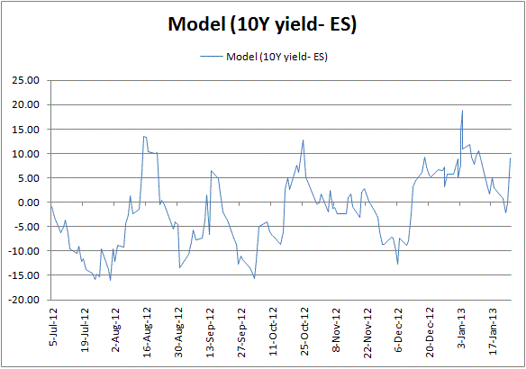
When you think 2 securities are correlated..the first thing you normally do is ask...how can i tell if this is true? The first route is to take prices, and graph them over some time interval (5 min, hourly, daily, etc...). In this case, i took closing ES prices and 10yr yields. I noticed that if i look from June 2012 to the present..there seems to be a tracking relationship...but with some deviation. This is exactly what we want to see in a correlated pair...basic tracking...but with enough slippage that the pair mean reverts over time to some "fair value" (both towards and away from...ie...it gets both rich at times..and cheap at other times). I know from experience that the treasury mkt tends to selloff or weaken between the start of the month and long end supply (10yr and 30yr auction supply concession). I also know that treasuries tend to richen towards the end of the month (the month-end extension trade). When i looked at this pair graph, and overlapped these time frames..lo and behold...this tends to be true...not always to the exact date...but generally speaking. So taking a few basic measurements and some time in excel...aong with a few assumptions that i had to verify from the data, i calculated that 4 ES contracts vs 1mm 10yr notes (or 11 ZN contracts) gave me the correct PnL graph to match the graph of the securities levels (after adjusting by a factor to put them in consistent terms). You can do this yourself if you spend some time in excel with the historical data. Then to answer the question "are treasuries rich or cheap vs stocks?" you can look at the graph and put the pair in historical context. I take this a step further and add a "fudge factor" to center the bulk of the historical distribution at zero...the highest and lowest points on the graph are not exactly equal distant from zero...but pretty close. Then i measure the distance from the point i've created as my "fair value zero" to the current mkt level...and violla....rich/cheap. While you could just as easily be measuring the rich cheap of ES...the UST component tends to be the more volatile component...and thus the one i've chosen to base my measurements. I could just as easily be saying that ES is 65 pts too rich vs where treasuries are trading right now...but since i more often just trade the bond leg on its own...i prefer to quote in terms of UST..so basis points (ie..if the 10yr were to selloff 13 bps right now..and ES didn't move...then i would say both are priced at fair value...alternatively..ES could selloff 65 pts and 10yr yields not move...and i would also say both are priced at fair value...given the last 9 months of this relatonship). This is not rocket science...just lots of basic graph interpretation and some basic math...combined with my intuition of what i expect...backed up with 9 months of mkt history.
If you do this exercise yourself (be prepared to spend some time fiddling in excel and playing with fudge factors to define the relationship)...you should find that the spread between ES and 10yr yields looks almost like a sin wave (from geometry...sin / cosine / tangent...remember those days??). That is a perfect example of a mean reverting relationship if you ask me. And since this is trading..you really never get perfect. If you look back pre-June 2012...this relationship breaks down. I haven't spent the time to figure out what the relationship was back then...but i can say with certainty that the regime shifted in the 1st half of 2012...and the resulting regime gives us this nice relationship to trade. I'll take it for as long as it lasts...and then when it breaks down (which it eventually must)..then i'll move on to something else. Thus is the nature of trading....
I stopped graphing the relationship back in January...since i built a realtime trading system and i'm involved in trading this everyday, i don't need the graphs anymore..so i stopped updating it...but if you do the work you should be able to reproduce what i have and then fill in the blanks for the more recent time period.
govttrader out...
No comments:
Post a Comment