While day-trading UST is not a tick-for-tick correlation to trading ES (S&P futures) or anything else, there is a strong correlation between the 2 if observed over a medium time-frame (say 6 months), and the correlation and the relative value "rubber band" behavior between these 2 markets should not be ignored. Also, when a large volume directional trade goes thru one market and not the other (as occurred today Nov 20 - ES unch and ZN down 11 ticks after a large seller appeared in the UST maket), a dislocation between these "correlated markets" will appear. If the markets tend to move together in a correlated manor, then these dislocations are necessary for the homeostatic spread to move at all. Understanding the difference between expected behavior and observed behavior can help in identifying large trades in the market when combined with our other metrics such as Market Profile and Bell Curves. So, I thought I would expand on how i measure the relative value between stocks and bonds as a primer to trading UST.
There are 3 main tasks to complete before we can use stocks vs bonds as a trading relationship.
1) The time-frame to use for our analysis
2) The hedge ratio between these 2 markets
3) The relative current position of this relationship vs its relevant history.
To determine the best time-frame to help us trade today, we first look at a picture of cross market activity over the last 5 years and tell a story, and then we will zoom in to the past 1 year, and then the last 6 months.

In 2008 and 2009, global markets were fairly coordinated.
In early to mid 2010, EUR led global markets down as Europe's problems became known to the masses. In this case, EUR was a leading indicator, and the other markets (ES and 10yr yields) lagged 3 months behind. By the time these other markets caught up to the Europe story in mid 2010, the EUR had already bottomed and began its recovery.
After the 2nd half of 2011 (1st week of august 2011 - S&P drops from 1340 --> 1101...18% drop in 1 week), stocks and UST were bought en-mass and decoupled from the other markets (notice the spread widens) from the expectation that the Fed would "print and buy its way out of a recession." These decoupling events are short and violent in nature. There is a shock, one market shifts away from the others, and then trading resumes along normal hedge ratios until either another shock, or the mean reverting force of the markets brings the decoupled market back in line.
If we now zoom in on the last 1 year (the period following the last Fed induced equity buying shock), we can see that the general nature of the markets are, more or less, coordinated. The coordination is not tick-for-tick, or even in time alignment, but in general over a weekly or monthly basis, the markets move in and out of line in a mean-reverting fashion. This is one of the holy grails in trading...finding a mean reverting relationship that is tradable.

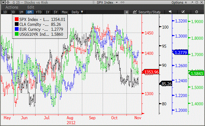
If we zoom in again on the last 6 months, we can see even easier how the markets move together in general, but in a mean reverting fashion. In particular, look at how the green line (10yr yields) zig-zag around the red line (S&P futures) and the blue line (EURUSD) and even the black line (crude oil).
If we use the last 6 months (or even the last 1 year) as the benchmark time-frame for our analysis, we find the best stocks vs bonds hedge ratio to be 10% . That's (0.1) * S&P - 10yr yield in basis points. We then normalize for the most recent period (the past 6 months) by subtracting 30 basis points. This give us a formula of :
{ 10yr Yield in basis points - 0.1 * ES Price - 30 }In simple tradable instruments, to trade this spread requires 2 ES contracts vs 11 ZN contracts.
Plugging in current market prices gives us:
158 - 0.1 * 1352 - 30 = -7.2
If we graph the last year of this spread relationship, we get this:

In this graph, downward motion in the line represents 10yr UST richening vs stocks (remember that UST and stocks should move inverse to each other...stocks up should = UST price down = UST yields up). By using a model spread graph instead of individual instrument graphs, we can more clearly see the relationship between the 2 markets. This model makes no statement regarding the inherent value in one market vs another. It simply displays and measures their behavior assuming our hedge ratio is accurate.
As you can see, during the 2nd quarter of 2012 there was a shift in sentiment between stocks and bonds stemming from the accumulation of central bank monetary expansion. Call it a "forward looking inflation cliff" for lack of a better word. As the Fed continued to print (and the market priced in more) USD to buy UST and MBS, the wall of printed money eventually overcame the historical trading relationship, creating a divergence in the spread. The divergence took from March to April to materialize, and after the divergence (a move of 40 basis points), the trading relationship between stocks and bonds resumed to its 30-40 bp range. This is just another example of a spread trading within a homeostatic spread range, followed by a paradigm shift, followed by range trading around a new homeostatic spread. While changes in the homeostatic spread level occur periodically (1-2 months out of the last year), range trading dominates the landscape. Like many other things in the capital markets, identifying the change in the level of the homeostatic spread is more art than science, but we can use our other tools (such as market profile and bell curves) to help identify them.
The first piece to this spread puzzle is to understand the proper hedge ratio between the 2 markets and how to use it. I've done the work, and determined that for the time being, 10 points in ES normalizes into approx 1 basis point on the UST 10yr. So, if you wanted to trade or just observe this relationship, the above formula and graph show you where the relationship is, both in its historical context, as well as in live trading terms.
Its difficult to show on this graph, but if we zoom in on each month individually, we can see that the 10yr UST consistently richens vs stocks as month-end approaches (typically over the last 3-10 days of the month) (the only exception is November of last year). From the flows that i've talked about in this blog, we should all now understand why that is the case. This spread graph is simply a visualization tool to help observe phenomena such as month-end.
Perhaps even more important than attempting to trade the stock vs bonds spread on its own is using the information that watching the spread conveys when using the spread to understand what is happening in each individual outright market. On days where the 2 markets are not moving in correlation, the spread will help you tell a story about what is happening in the market with the larger relative trading volume.
Watching and trading a spread like this tends on its own to only provide 1-2 high probability spread trading opportunities per month (because the intra-monthly range is so large), so we need to add other trading models to our playbook. However, the first step to building a playbook is "one play at a time." Adding this play to our market profile interpretation of 10yr and 30yr auctions makes for 4 plays to watch for per month outside of our standard Market Profile model.
If we add our standard Market Profile trading model, that should indicate 2 trades per week on average = 8 trades per month.
While 12 high probability leveraged trades per month is probably enough for most people, (and most single strategy hedge funds) why stop there? In the future i'll talk about adding Credit, FX and Energy into the multi-asset equation. We will also talk about "reading the tape." Most people refer to "the tape" as the executable market for a single instrument. We here at govttrader look at spread markets as executable also, so "tape reading" involves real-time monitoring of not only the outright markets, but the relationships between markets as well.
Rates traders for example will recognize this as the yield relationship between 10yr yields and 30yr yields (the 10/30 yield curve). Adding stocks vs bonds gives us another relationship to monitor in real-time in combination with everything else we watch to indicate what the large flows are in the market. This is the key to trading...if you know where the large trades are taking place, you can be both a trend follower and a range trader, and not get bamboozled when a market transitions from one mode to the other.
more later on the blog and twitter....govttrader out...
Interesting, thank you.
ReplyDeleteHow did you come up with stocks/bonds hedge ratio?